De Cecco Packaging restyling
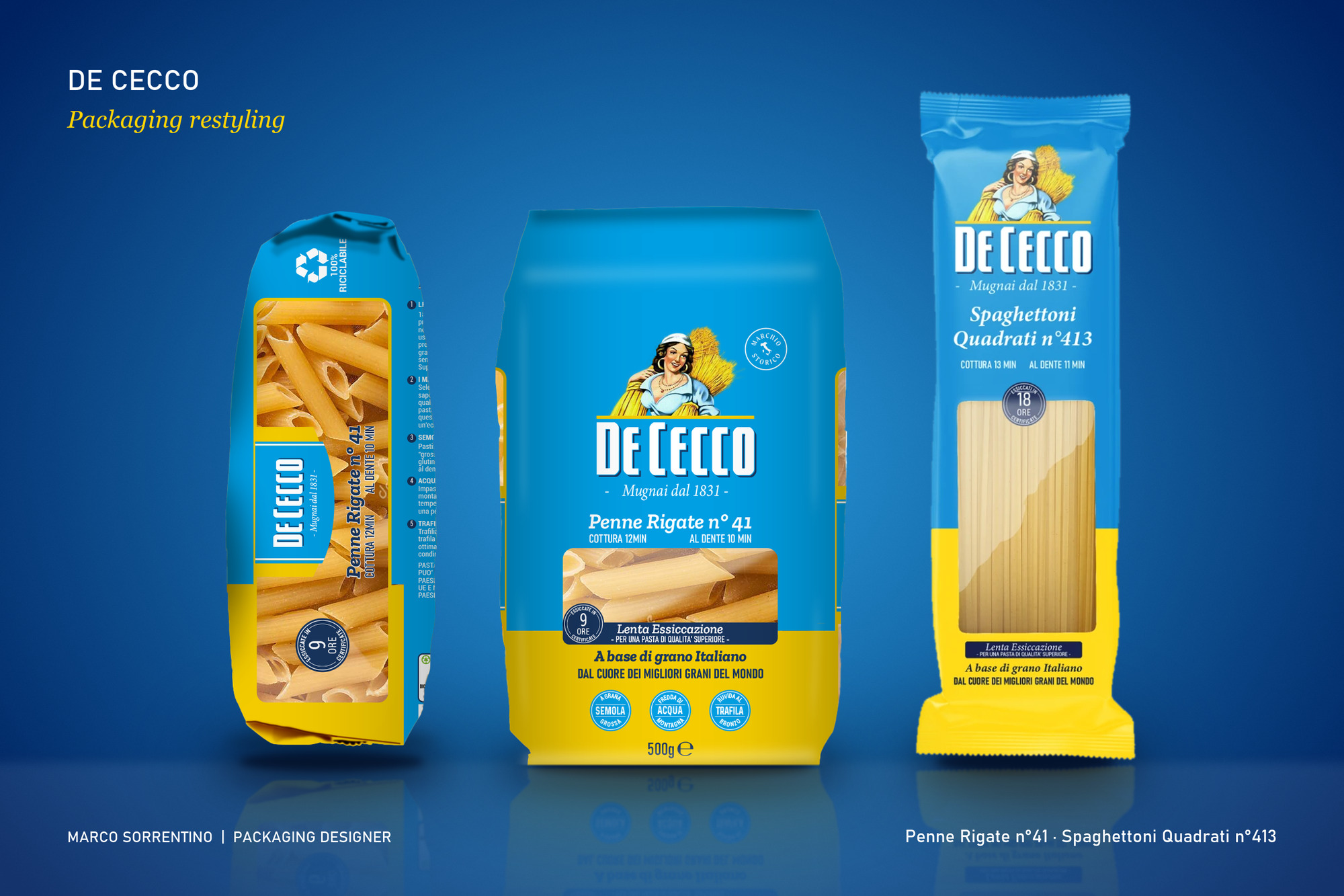
Packaging restyling of two iconic formats in the range, Penne Rigate n°41 and Spaghettoni Quadrati n°413. A stronger brand mark and historic figure, clearer information and a blue and yellow livery that reads from a distance, on the shelf.
- Field
- Packaging · Method study
- Client
- De Cecco (IDI Italian Design Institute project work, not commissioned)
- My role
- Packaging design and mockups
- Period
- 2022
The challenge
The original pack had its logo in a downward-pointing triangle and a small, barely visible figure. Its livery stood out little on the shelf, where blue is the competitors' dominant colour. The benefit area held some superfluous elements.
Approach
Three interventions. The logo: an enlarged figure and “Mugnai dal 1831” (“millers since 1831”) in place of “dal 1886”. The blue and yellow livery, more recognisable on the shelf, with the “Marchio storico” (historic brand) seal prominent on the front. The benefit area: reorganised with three badges, in keeping with the brand, the product and the regulations, with more legible mandatory data and QR code.
The boards · 13
The study
Observations on the original pack
Logo in a downward-pointing triangle, small figure, livery barely visible on the shelf, benefits to be reorganised.
Competitors
The comparison with Barilla and Voiello: on the shelf, blue is the dominant colour.
The logo
Upward-pointing triangle, larger figure and “Mugnai dal 1831”.
Historic brand
De Cecco is the first dry pasta producer entitled to bear the title “Marchio storico di interesse nazionale” (Italian Ministry of Economic Development, 1/2020): the seal appears on the front, the text on the back.
The design
Before and after
Larger figure and logo, blue and yellow livery, benefit area with three badges in place of the text line.
The system
A coherent range: the same hierarchy across front, side and different formats.
Details
Mark, figure and quality badges.
Brand board
Palette, typography and the three choices that guide the project.
On the shelf
In context
The packs in an Italian kitchen.
Shelf impact
The blue and yellow livery reads even from a distance.
For printers: dieline and specifications +Close dieline and specifications −
Dieline
Front, back and sides in a single file: mandatory data, QR code and product window.
Technical specifications
335 × 280 mm dieline, external printing, 7+1 colours: dimensions, windows and seals.
Project work carried out at IDI Italian Design Institute (July 2022), not commissioned. The brand, name and products belong to their respective owners. Text inside the images is in Italian.
End credits
- Deliverables
- Analysis of the original packaging and of the competitors
- Graphic restyling of Penne Rigate n°41 and Spaghettoni Quadrati n°413
- Flat dieline with mandatory data and QR code
- Mockups: before and after, system, in context, shelf
- Brand board with palette and typography
- Tools
- Adobe Illustrator · Adobe Photoshop · Adobe InDesign
Let's talk about your project.
I work remotely, in Italy and worldwide. Tell me in a couple of lines what you need: I'll reply personally within 48 hours.